

Take a look at Hide’s branding and marketing journey
The branding and marketing of Hide began as we met with our chosen branding agency: Don’t Panic. With their headquarters on Scawfell Street being a mere three-minute walk from site, we couldn’t have chosen a closer agency. We knew we were putting a team of Hackney experts on the case to work with Natalie, our in-house Brand Manager.
From the get-go it was clear that our naming concept should be greatly informed by the locality of 291 Hackney Road. Our new collection of apartments are tucked away behind the bustling street and nestled in the courtyard of a Grade II listed former church. Once complete, each home will benefit from verdant views into Haggerston Park and the grazing animals of Hackney City Farm, all whilst sitting on the doorstep of Broadway Market, Columbia Road, Shoreditch and The City.
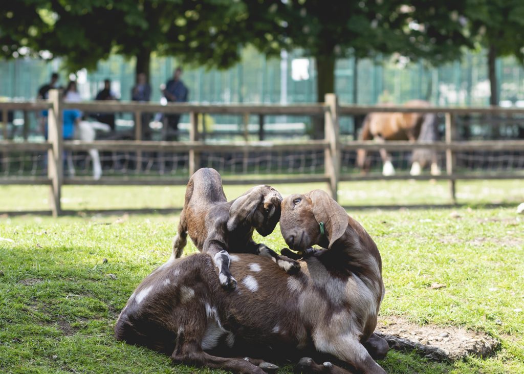
The development’s name needed to encompass this juxtaposition of rural urbanity, where future residents will find a peaceful sanctuary hidden in the centre of the action.
We tossed countless ideas back and forth, unable to settle, when we received an excited call from Mark Whiteway, [DPP’s Co-Founder]. He announced: “Hide – to put out of sight, or a camouflaged shelter used to observe wildlife at close quarters.”

Not only did both definitions fit the location perfectly, but the words also resonated with the plans of our designers at Scenesmith, our architects at Manalo & White and Artform’s in-house design team. The external facade, although contemporary in design, features a grey-ochre toned brick reminiscent of the church walls, and a bespoke arched balustrade informed by the church’s windows. The concept of being tucked away in a ‘camouflaged shelter’ worked. And for the interiors, Scenesmith’s ideas were being heavily influenced by the organic, elemental nature of the farm and park.

With the name decided, Don’t Panic showed us a variety of typographical options for the Hide logo. We were immediately drawn towards the hand-written fonts they’d created using charcoal pencils. This human, natural style once again linked to the primary, basic notions stirred up by the farm and surrounding green spaces. It seemed fitting that the brand should then continue this theme using hand drawn illustrations alongside the text.

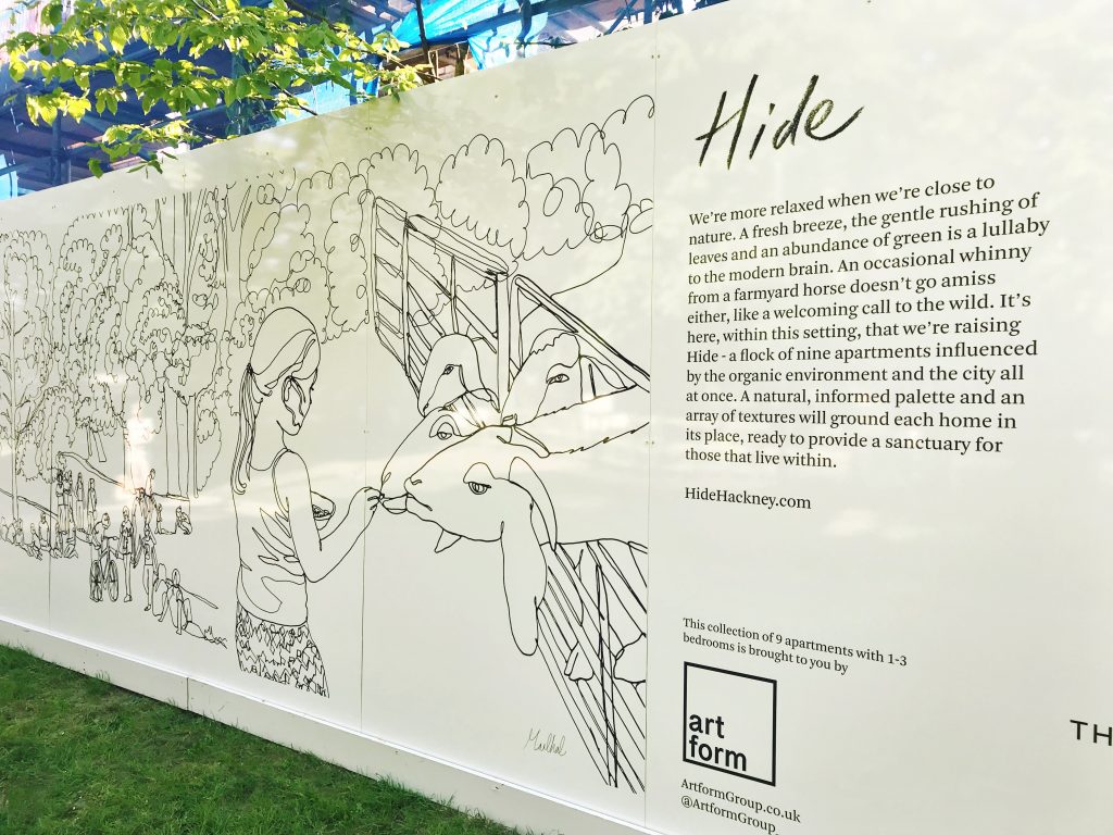
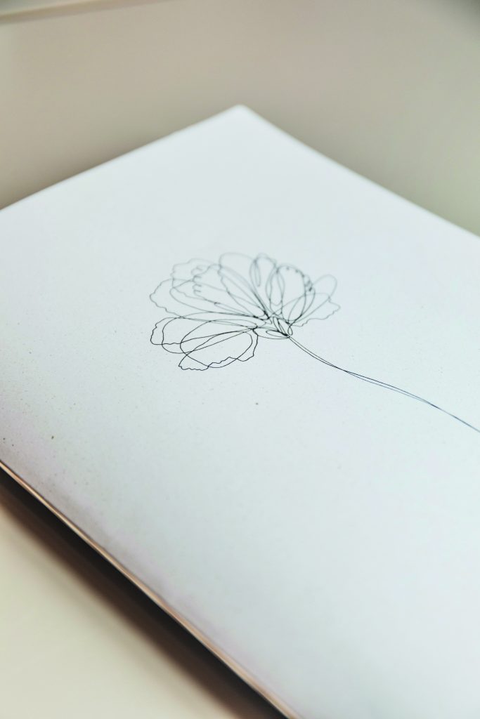
Finding our illustrator, Martha Lamont, was down to a chance meeting. We had been visiting the Hide site when we came across Martha painting a mural on the wall of the driveway. Her style aligned perfectly with our vision – simple and clean continuous line art. We worked with Martha to create a hero image of Hide for the website, as well as a series of drawings for our hoarding in Haggerston Park. Later on in the project, Martha drew what came to be known as the ‘Hide Flower’ used on our brochure cover, plus the smaller scattered illustrations throughout.
Working with Martha was a dream. She captured Hackney perfectly. When we first installed the hoarding, it was brilliant to see how many passersby stopped to appreciate her piece.
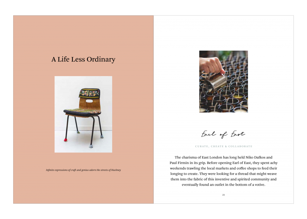
The brochure, we felt, should follow in an editorial format, with a view to offset the organic softness of the logo and illustrations with a curated, structured composition. A decision that would reflect the effect of the city on the park and farm. Overall, our aim was to imbue the brand with a sense of calm refinement.
A visit to the London Metropolitan Archives had uncovered the site’s history as a Victoria tilery that specialised in terracotta tiles. We weaved this tonal thread through the project, permeating Scenesmith’s warm clay-toned interior concepts and our brand’s colour palette. Hide’s verdant surroundings were also pulled through into the brochure.
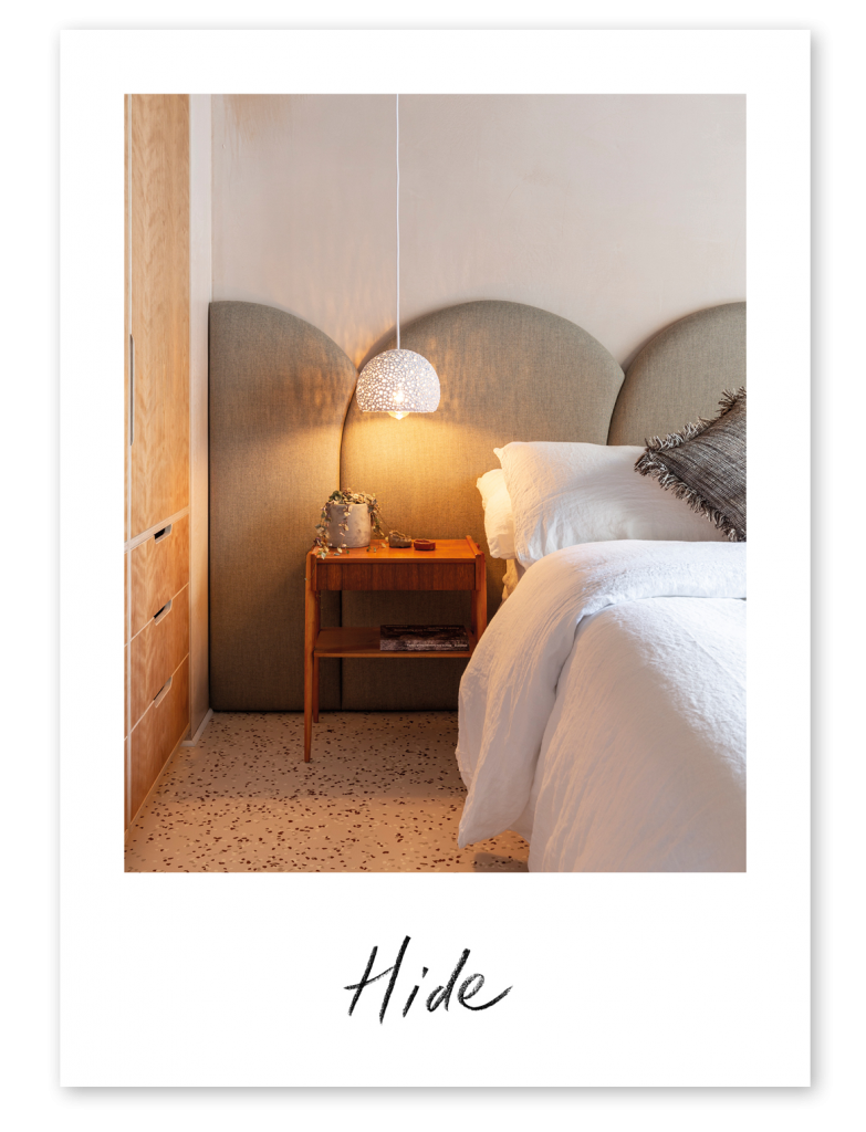
Usually, we’re unable to include photographs of the finished show home in our brochures as we print them before the interior is complete. We felt that representing Hide using CGIs would be a huge shame, and so we worked with Don’t Panic to find a solution. The brochure would still be printed beforehand, however, we chose to design a curated pack of postcards that could be printed quickly and added later, once the show home had been photographed.
When we came to choose a stock for the Hide brochure, box and postcards, we knew we wanted a paper that felt warm and natural. Don’t Panic presented a sample of Favini’s Shiro Alga Carta stock in Bianco and we fell in love at once. The paper began life as a way to use the damaging algae blooms of the Venice lagoon, and today this concept has been extended to other fragile marine areas. Favini combines the best of paper-making innovation using renewable non-tree biomass and recycled waste, forming a delicately flecked stock that adds a textural depth to Martha’s illustrations.
Favini once again stole our hearts when we saw their Crush paper, a stock made using the process residues of organic products. For the boxes, we chose the green option which gains its pigment from the organic matter of kiwis saved from landfill. The Kiwi Crush also had a light fleck that complimented the brochure paper.
The branding and marketing of Hide has been an exciting project for Natalie and our team, and we’d love to know what you think. Click here to take a look at the complete brochure. And, if you’d like to find out more about viewing the show home, please click here.
Send us your feedback via any of our social media channels, or pop an email over to info@artformgroup.co.uk. We’d love to hear from you.